Work
Play
About
Work
Play
About
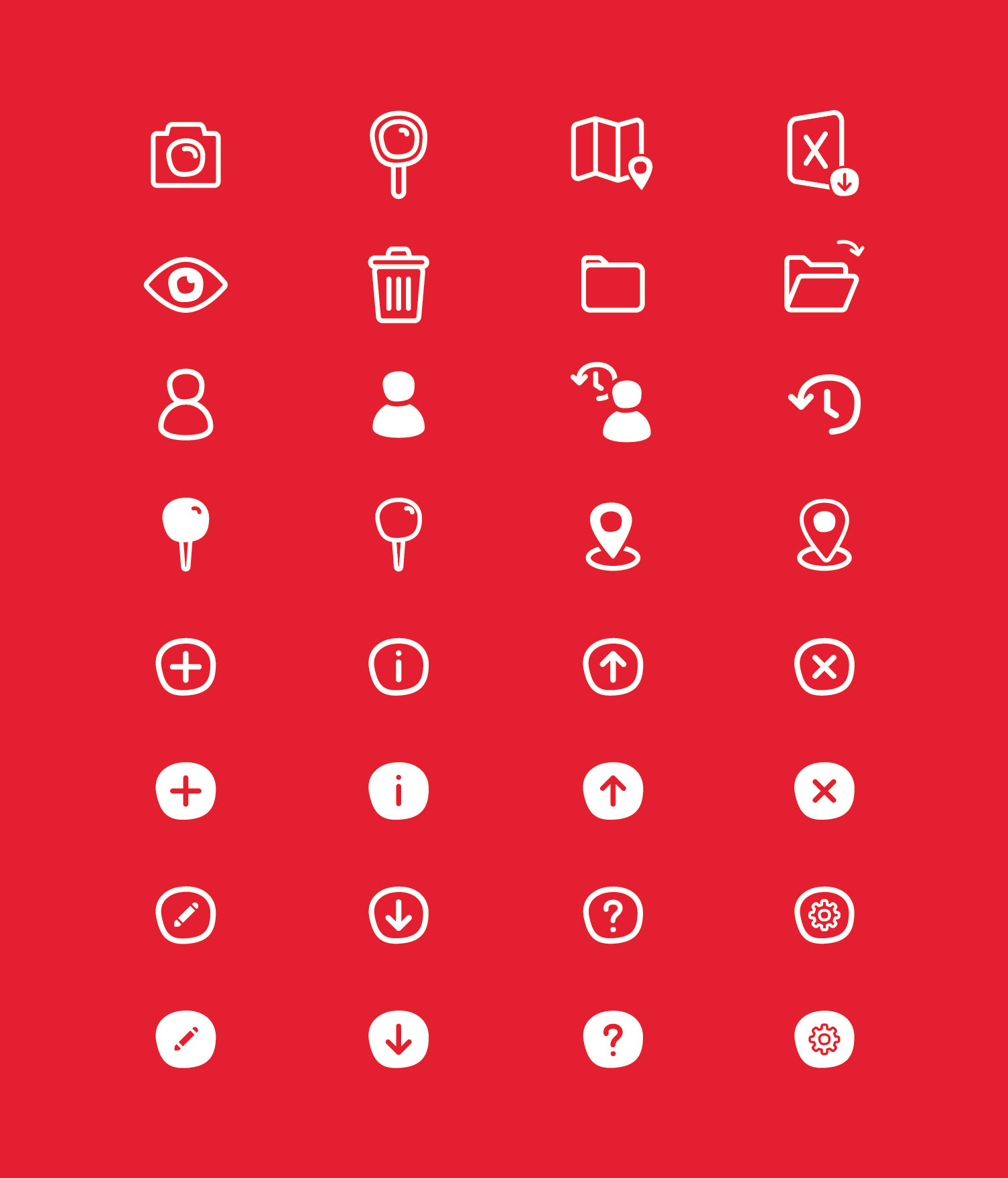
Location Siting App Icons
I was tasked to create an icon set for an internal application which aims to improve location siting processes within the organization. In order to have consistency and be distinctive, I used the Migo logo's shape as a recurring element.
↑
Back to Top